A/B testing?
Wild shots in the dark!
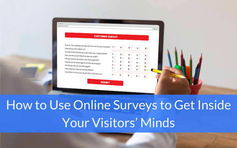
But what if you could actually ask your visitors point blank how they felt about your website instead of guessing and testing your guesses?
Even Google uses this method on some of their sites. And if a company that famously tested 41 shades of blue to see which one would convert the best is doing it, then you know it must be getting some great results.
1. Nail down a specific answer you want to get with your Feedback Survey.
Examples:
- I want to know what type of content my readers want more of
- I want to know how useful they find my tool
- I want to understand why they are leaving the page without performing X action
- I want to understand their main reason not to buy now
This helps you focus on formulating an online survey question that is specific and worded properly to get the answers you are looking for.
Here are best practices for phrasing your surveys so visitors do in fact provide answers and give you the answers that you’re actually looking for:
- Wherever possible, turn the likeliest answers to your survey into multiple choice options a visitor can just click one. Make it optional for them to elaborate on their thoughts in a text area comment. This will significantly boost your response rates.
- Ask one specific question for each step of the online survey. Do not overwhelm your visitor with a series of questions all at once. This is similar to the conversion principle of one campaign = one goal, one page = one goal.
- Avoid asking hypothetical questions like “If this page was shorter, would you [do this]?” Asking visitors to imagine what they would do in situation X, Y and Z takes extra work which visitors may not do and forces them to guess, which may lead to inaccurate answers.
2. The reasoning behind why you should use Exit Intent Surveys.
A. Use Exit intent surveys to gauge overall site experience and usefulness.
Triggering the survey on exit intent is effective when you want to ask visitors what their overall experience of your site was.
You can split your online survey to be two parts so that asking for too much information in the first part doesn’t overwhelm them.
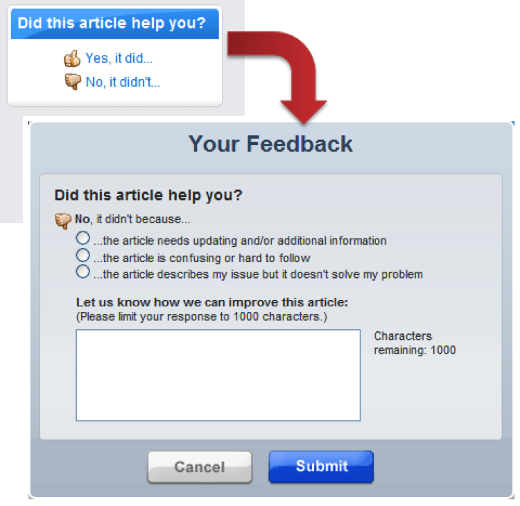
Here’s how TurboTax set up their survey to get feedback on the helpfulness of their articles:
Source: TurboTax
In the first step, it simply asks you if you liked the article.
In the second step, it offers you a few choices on why you may have disliked it and asks you to elaborate.
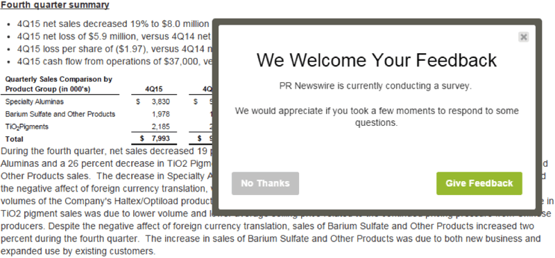
Here’s an example of a poor survey request from PR Newswire:
Source: PR Newswire
Why is it a poor example?
It popped up three seconds after I started reading an article. How am I supposed to provide informed feedback if I haven’t even had a chance to browse your site yet?
Also, it took me to a survey like this…
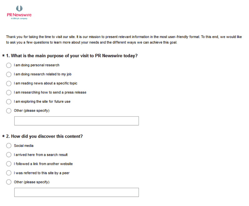
Source: PR Newswire (There are seven other questions not shown in the picture.)
That’s overwhelming to say the least.
They did have an interesting offer near the end though:

Source: PR Newswire
If you can afford to offer a monetary award like this, it makes sense to put it at the top so more people can see it to take you up on your offer.
Also in PR Newswire’s case, it would make sense for them to display this offer in an exit intent slide out for visitors who have New York City IPs instead of burying it in a long survey.
B. Exit intent surveys should be tailored to the goal of specific, key pages.
You should create online surveys tailored for specific key pages like your home page, pricing page and article pages.
Pricing PageMany visitors leave a pricing page without buying. Since before you could never directly ask visitors why they left, it was difficult to guess the exact reason. So, you had to form a bunch of hypotheses and run A/B tests to try to improve your conversions, a very time-consuming process.
Enter surveys.
Now when a visitor leaves, you can simply trigger a survey that asks them to select a reason why they did not choose to buy today (and you can customize it to your own products and audience).
Here are the options that Vero (a SaaS product) lists in its survey:
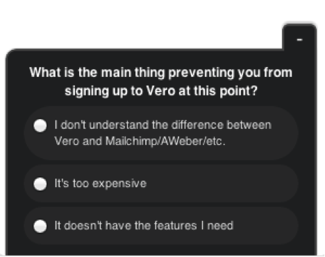
Source: Vero
Based on a 2014 WorldPay survey, here are the top reasons why visitors decided not to buy. You can use it as a handy reference to create multiple-choice options for your own survey:
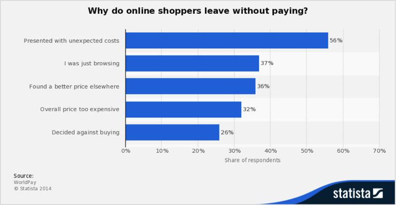
Source: WorldPay
You can also consult this comprehensive guide of pricing strategies to get new ideas about how to improve your pricing page to reduce exits.
3. How to analyze your survey feedback and testing improvements.
A. Multiple Choice Survey
If you ran a multiple-choice survey, take a lot at what the top two most common choices are.
Let’s say that you ran a survey on your pricing page and the top selected choice is: Too expensive.
Now you can brainstorm a few different possible improvements:
- If you have pricing plans, create a lower level tier with less features or functions so you can charge less for it
- Tweak your messaging to better convey the value of your product and service and justify your pricing
- Install a live chat like Tawk.io so people can directly ask you questions to understand the value of your product
Once you have several solid ideas, it’s time to run the famous A/B experiments to see which improvements yield improved conversions. During this time, keep your survey running to see if fewer visitors are selecting the ‘too expensive’ option as the reason why they did not sign up or buy today.
B. Long Answer Survey
Go through each answer and isolate the negative sentiments and group the similar ones together.
Examples:
- “The landing page editor is a real pain point. It feels like a 2004 experience.” + “The landing page building tool is a bit of pain to use.”
- “The speed of the platform is often troublesome.” + “Sometimes it takes a while to load.”
Next, brainstorm improvements you can make to tackle each sentiment and run an A/B test between the old version and the new improvement to see if it performs better.
You can also repeat this process for positive sentiments. Group the similar ones together and pick out power phrases and words to either use directly in your marketing copy or product positioning.
Example (power phrases in bold):
- “…allowing you to quickly identify patterns and see if users are behaving as expected.”
- “Great for generating conversion test ideas based on where visitors are clicking and scrolling.”
- “Provides some great on-page visuals that are easy to understand.”
Key Takeaways
Here are some key takeaways for to remember:
- Online surveys let you get inside of a visitor’s head to figure out exactly what they like and don’t like instead of you having to guess and run multiple A/B tests.
- It’s ideal to trigger your surveys upon exit intent so you don’t interrupt a visitors’ browsing experience and so they have the time to form an informed opinion of your website.
- Make it as easy as possible for visitors to answer your survey so you can get more (and more useful) responses.
