
How can you enhance your site's landing pages to turn more prospects into qualified leads?
We recently attended Unbounce's Conversion Road Trip Chicago and learned a lot about enhancing landing pages from conversion rate optimization experts Oli Gardner, Michael Aaagaard, Angie Schottmuller and David Kadavy.
Here are six of the most important lessons we took away and how you can implement them on your own site.
1. Be more specific with headers
Often the text on landing pages can be misleading. For example, if your downloadable asset isn’t offered on the landing page, but after the user submits the form, the header of the page shouldn’t read, “Here’s Your Whitepaper,” etc.
Furthermore, sometimes the subheader and header simply need to be switched. Oftentimes people will put the title of the offer first and a subheading explaining the value after, when what you really want to do is have the value message first.

This landing page clearly states the value you'll get by filling out the form.
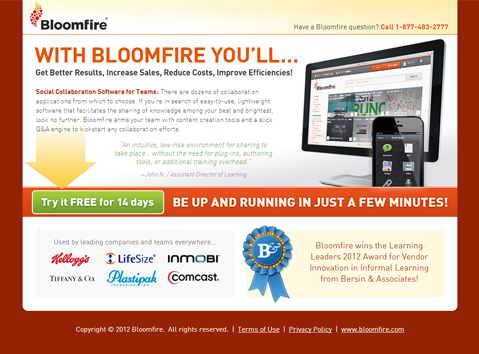
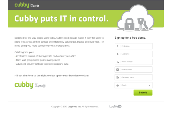
2. Fix your forms
When it comes to form fields, have the bare minimum. Remember, you can always get additional information later.
People don’t want to have to fill out a lot of form fields. If you need specific information for a specific offer, include the necessary fields, but cut out those that aren't 100% necessary.
You should also use a word other that “Submit” on your forms, as this has negative psychological implications. Instead, use something like “Download Now” or “Get My Free Quote.”
Only two form fields? Amazing! More people will be willing to sign up.
3. Stay away from clutter.
Don't include unnecessary text or images. Think of your landing page as a high value property: you want to get the most out of your real estate without making it cluttered.
Nothing's more of a turn-off to current visitors and prospective leads then being assaulted by an overwhelming amount of information. Keep your landing pages simple and to the point.
Be very strick about what you decide to include on your landing page. Don't clutter!
4. Be concise
Tighten up the text on your landing pages. Instead of "during this trial, you’ll have access to" you can shorten it to simply “gain access to.”
You can also try pairing down the offer's description and features and instead make the remaining font larger so it’s easier to read.

When it comes to landing pages, don't be wordy. The simpler you can say it, the better!
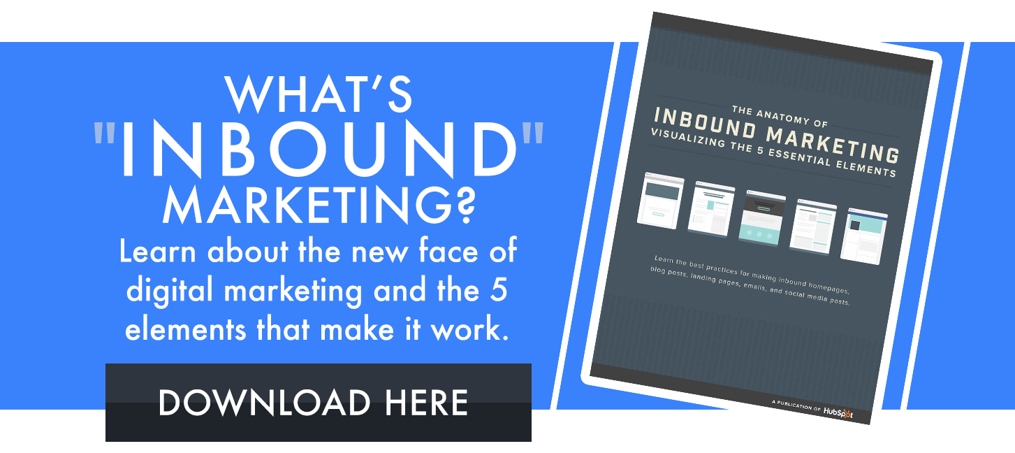
5. Be clear about value
Be incredibly clear about the value the page and offer is providing. Ensure the biggest indicator of value is somehow highlighted or featured on the page.
The value provided by this SaaS company is very clearly stated.
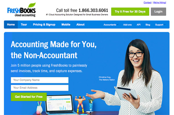
6. Use the right colors
Don't use pure color for your text, which decreases readability. Instead, focus on choosing a main color for the page or image and then use the complimentary color for the CTA button.
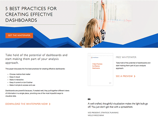
The "Get the Whitepaper" button is orange, the complimentary color to blue (the predominant color on the page).
Conclusion
By using these awesome tips from four of the industry’s leading conversion rate optimization experts, you can improve the usability and readability of your pages for your users and increase your conversion rate!
If you’re interested in what else went down during the Conversion Road Trip, check out the top four things we learned.